Daily, countless Ktm-ians (Ktm-ans, Ktm-ese??), try to squeeze themselves into a tightly packed lattice of humans in a microbus during office hours. If you’ve got your own means of transport then you have no problem. But, believe it or not, many people don’t have their own car or bike or both. I am one of those people and I have experienced the suffocating and back-breaking conditions inside a packed public transport in the valley.
If you get a seat, that’s great. If you don’t, what do you do? Previously, there used to be two options. The first was to wait for another vehicle and hope you’ll get a seat there. The second was to call a taxi, roll your eyes and curse the driver internally at the outrageous price, and then pay that price. But thanks to the ubiquity of the internet and the smartphone, another option has become available to the general public. That is the horde of new ride-sharing (especially bike sharing) services.
There are two major bike-sharing services in Nepal right now: Tootle and Pathao. We have covered both these services extensively in our site and we were one of the first to bring you the news about the spat between the government and these ride-hailing services a few months ago. And now, as the dust of that brief dispute has settled and it looks like these services are here to stay, we thought we should set out to review these services for our readers.
Pathao
In this article, we will look at the newest ride-sharing service in the country – Pathao. This review will be dedicated to the ease of use and the features of the Pathao app.
The design
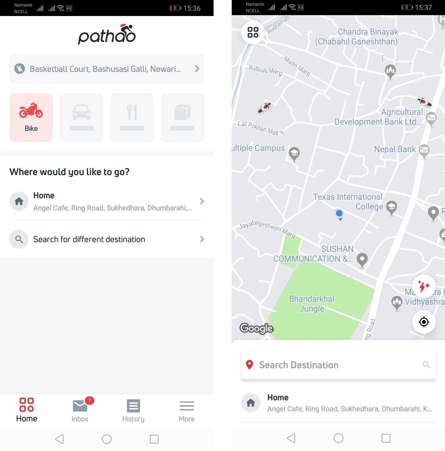
Pathao app has undergone a lot of changes since its first release in Nepal’s Play store/ app store. The button layout has changed, and the structure of the UI elements have changed too. The overall color profile is still the same: white background, black/grey texts, and a smattering of red here and there used to highlight something. This is a very simple design and effective. It looks minimal, it doesn’t confuse the user with a lot of buttons and a lot of unnecessary visual elements. The red immediately draws the attention of the user to the things that he/she needs to be aware of.
If I had one complaint about the home screen of the app, it would be this: why isn’t the search bar at the top for searching the destination? Whenever I try to search for my destination in the app, I instinctively reach for the search bar at the top. But that is the search bar for your pickup location. Why would you need a search bar for your pickup location? And if you do, which search function do you use the most – destination or pickup location? Thankfully, if you are a regular user, you learn to see the “Where would you like to go?” part of the home screen and search your destination there.
More about the UI
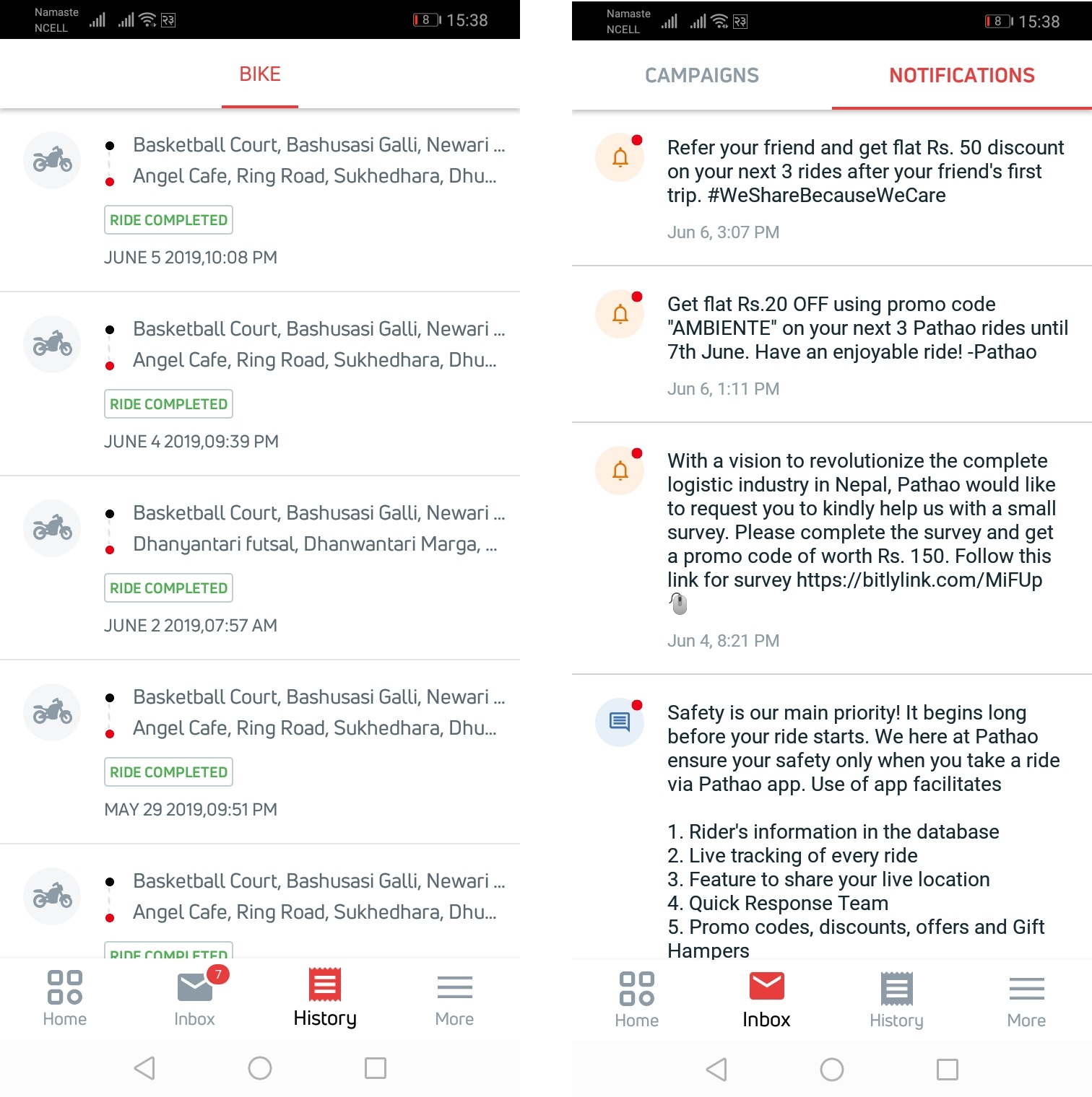
The button layout at the bottom has improved too. There are four buttons at the bottom of the home screen – home, inbox, history, and more. If you want to see your riding history, you click on the history and you will be presented with the list of all the rides that you have taken since the time you signed up on Pathao. If you want to know more details about a particular ride, you can click on one of your rides and you’ll be presented with the price you paid, the name of the rider, the time that your ride took, the rating that you gave your rider, the distance that you covered, the discount that you got through a promo code, and your pickup and drop off location.
This is a pretty extensive history but Pathao could have displayed the exact track that I followed in the ride. Tootle has this feature. But this whole history info on Tootle isn’t presented as attractively as on Pathao.
Inside inbox, you have your notifications. Here you will find your promo codes (codes that will give you discounts) and Pathao’s requests to go to this or that restaurant if you want to get a discount. The place to apply your promo code and change other settings are available inside the more tab.
Booking a ride
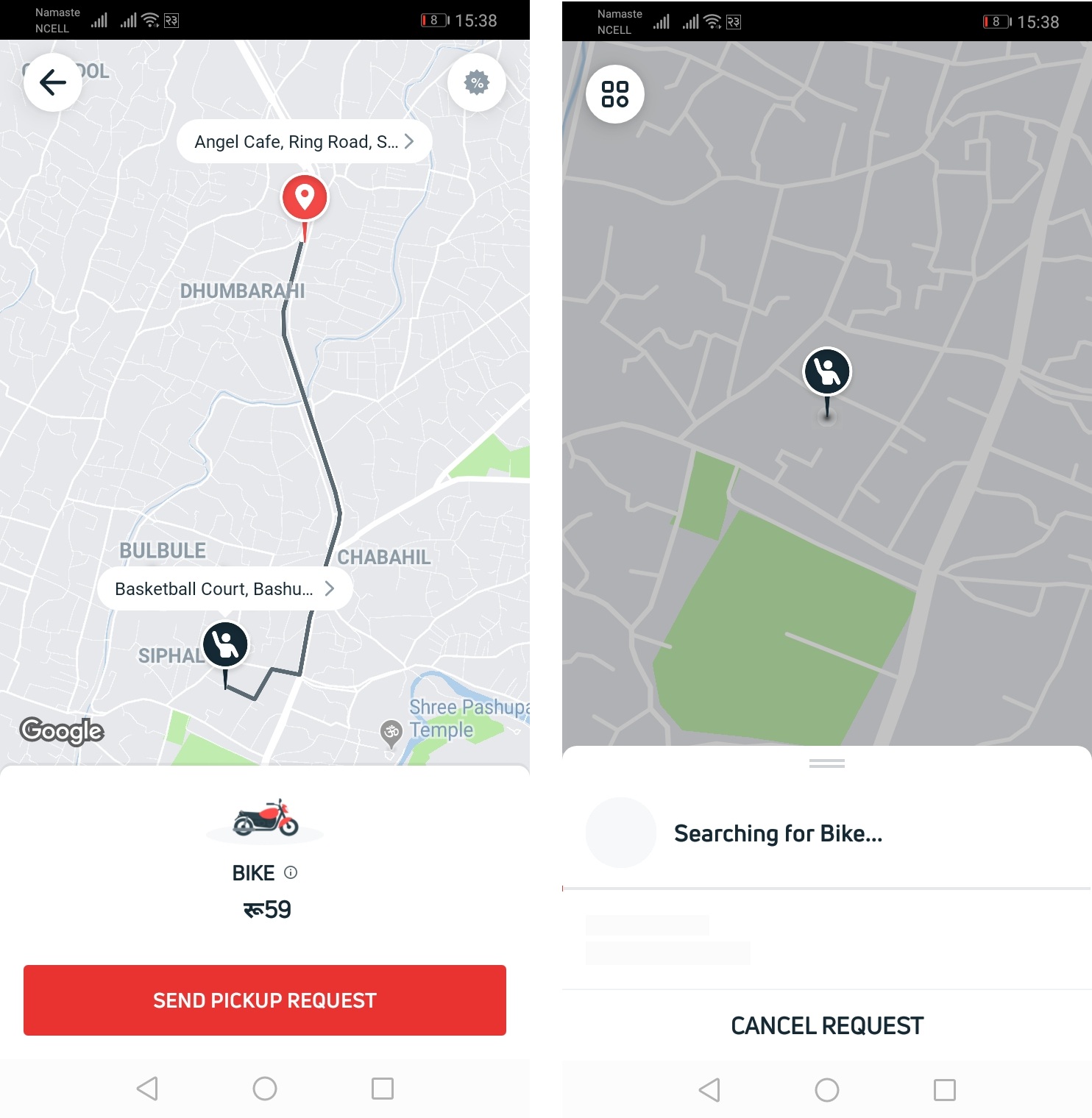
Overall, booking a ride hasn’t been a hassle for me. To book a ride, tap select destination, search your destination, send pickup request, and after a short time you are given the information of the rider that accepted your request. Its simple and intuitive. However, I will say that the process of selecting the ride and booking it feels easier and faster in Tootle. When you first open the Tootle app, you are prompted to set your pickup location then you are asked to select your drop off location. It’s much easier. This might be my personal preference; drop your comments below if you feel otherwise.
Features missing
Another feature that we found missing in the Pathao app is the ability to select the gender of your rider. Tootle allows you to do this. So, if you are a female, you can choose a female rider if you feel safer that way. However, if you are a male, there’s no option to choose a female rider.
And while we are in this subject, I kinda have some issues with Pathao’s map. It feels very detailed and every small shop’s name is in there. But that level of detail is precisely the problem. When I type Banasthali in the destination search box, the app gives me a list of unknown shops and pharmacies and I don’t know which one is near the Banasthali Chowk. The worst part is, you have to choose one of those options. You can’t simply enter Banasthali and hit enter and hope that the app understands that you want to be dropped off at the Chowk. This is very annoying, and it often pushes me to select my destination by setting the location on the map itself.
This is not a problem with Tootle. I hope Pathao is working to fix this issue.
Overall
Pathao has been very consistent in my time with the app. It has been fast and fluid. It hasn’t stopped sending me notifications about the traffic on my usual route. And the riders in the service have been friendly. The app hasn’t crashed like Tootle does sometimes and my experience using it has only been positive. When the app was first released, I was angry that its service didn’t reach my home inside the valley. But Pathao has now expanded coverage and if I want to I can travel from my home to work using Pathao only.
One thing that I would love to see introduced in this app is sort of a subscription service. So that for someone who relies on the rides daily, this would be even more affordable and Pathao can rest in peace that it has many loyal customers. Also, when this idea takes flight, I would love some cut of the profit.
Download Pathao App
-
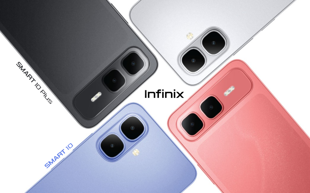
Infinix Smart 10 and 10 Plus Gets Another Price Hike!HIGHLIGHTS The Infinix Smart 10 series price in Nepal now starts from Rs. 14,999 (4/64GB).…
-
POCO X8 Pro Series Coming to Nepal This Week!HIGHLIGHTS The POCO X8 Pro series will launch this week in Nepal. The POCO X8…
-
You Can Now Pre-Order the Samsung Galaxy A37 in Nepal: What Has Changed Really?HIGHLIGHTS The Samsung Galaxy A37 price in Nepal starts at Rs. 64,999 (8/128GB). The phone…


