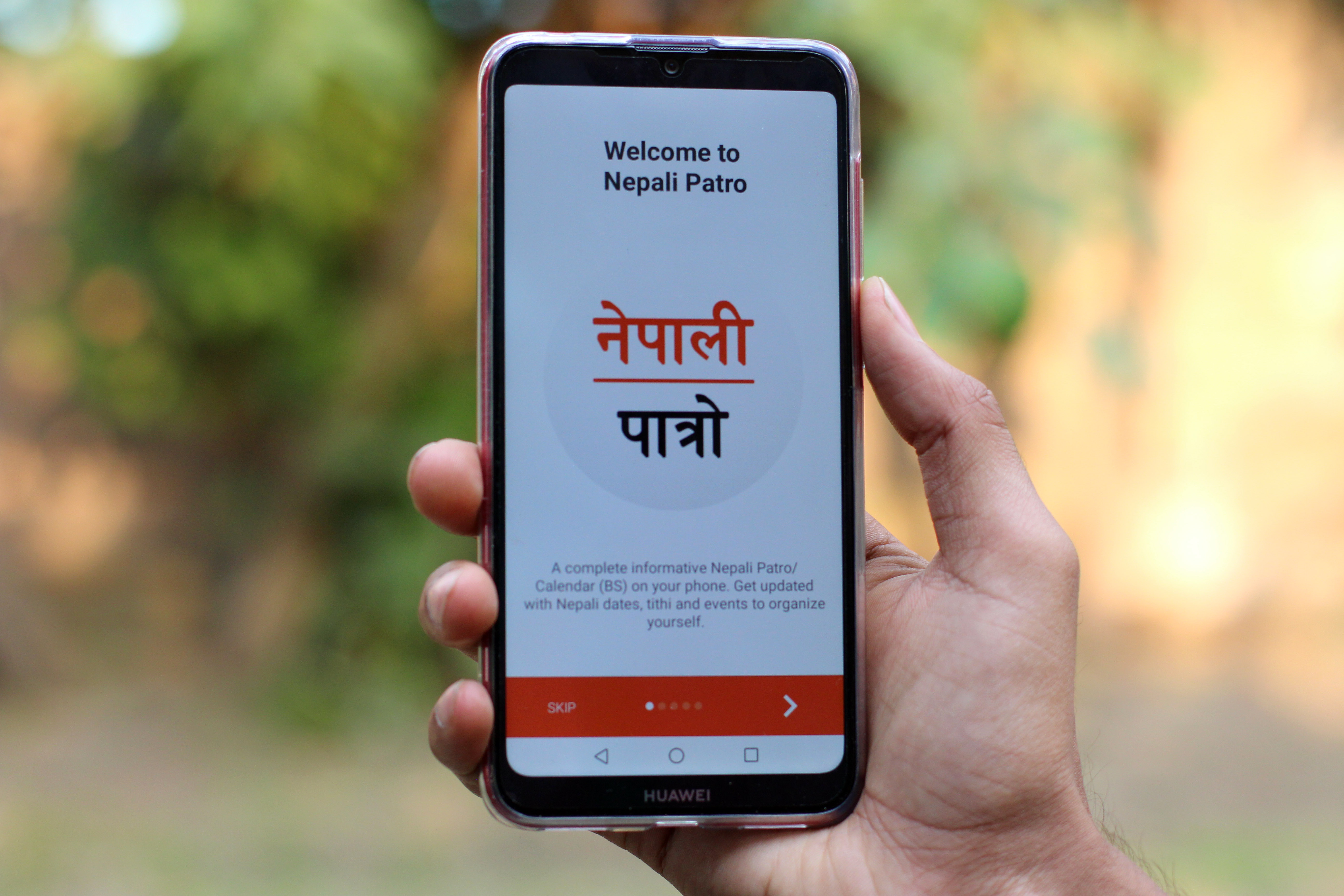
I am sure most of you have heard of Hamro Patro. You probably use it too. But it’s not the only app of its kind in Nepal. There’s another, lesser-known app, called the Nepali Patro. Today we are going to take a look at this app and discuss the good, the bad, and the ugly. At the end, you may be tempted to switch to this app from Hamro Patro. Who knows?
Looks
The most important part of any app, at least from the consumer’s viewpoint, is the UI. How does the app look? How does it feel to use? To that end, I have to say that I have mixed feelings about Nepali Patro.

Nepali Patro still feels like an app that hasn’t been updated for over a year. The orange theme that they have going on still doesn’t appeal to me very much. It feels overly bright and saturated. This is most conspicuous in the home screen where Nepali Patro has decided to dip the whole calendar in bright orange. The coloring is tolerable in other parts of the UI.
I didn’t like the UI of Hamro Patro either but that was before the Mega update it rolled out a few weeks ago. Now, Hamro Patro has a more appealing design with rounded icons and blockier texts. It also has a dark mode too. So, for the looks, I will have to give the edge to Hamro Patro.
Ease of use
The ease of use is a different thing though. Nepali Patro has the options for calendar and news right at the bottom of the screen. Hamro patro has those options hidden inside the hamburger menu at the top left corner of the app. This means you have to press one less button to get to the stuff you need in the Nepali Patro. That’s good design.
The calendars
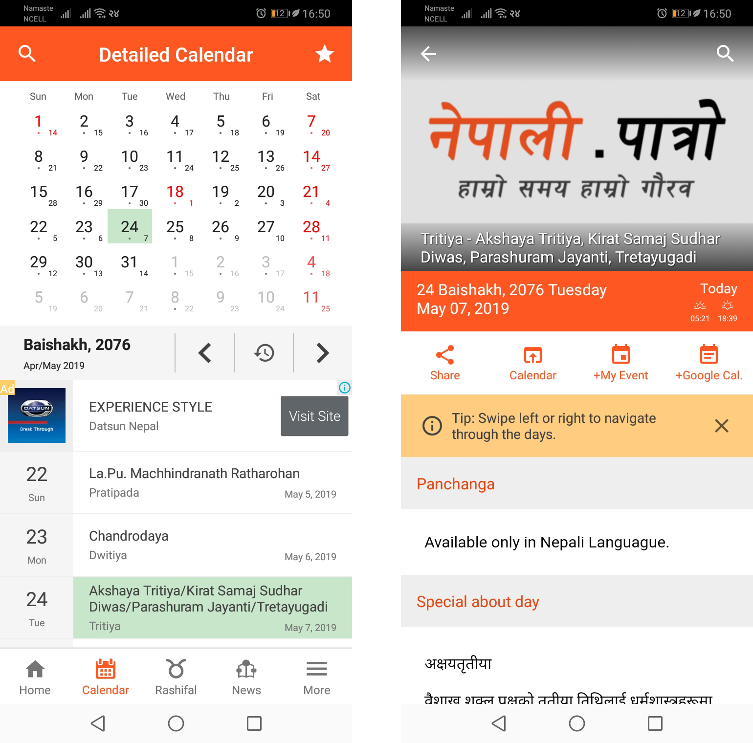
As the calendar is the major part of both these apps, let’s dive into the calendars of these two apps. After using the calendars of both Hamro Patro and Nepali Patro, I have come to like the calendar of the Nepali Patro better. It’s far easier to read than Hamro Patro’s calendar. The dates are less spread out and the design is much cleaner.
What also helps is that the people who chose English as their default language for the app will get their dates in English as well. You will still get the Bikram Sambat calendar but in the English language. I noticed that Hamro Patro didn’t have this feature after I used Nepali Patro. Now, not having my calendar in English feels like a huge drawback in Hamro Patro for me.
Next good feature in the Nepali Patro’s calendar is the ability to add events and reminders in the app. Adding events and reminders works in a similar fashion to Google Calendar. You tap a date, add an event, specify if its an all day event or allocate a time slot for it. You can’t do this in Hamro Patro. You can only add notes there. There is no option to be reminded at a particular time of day. This feature is far more advanced and robust in the Nepali Patro app. Also, you don’t have to log in to Nepali Patro to use this feature.
Overall, I prefer the calendar in the Nepali Patro.
Horoscope and News
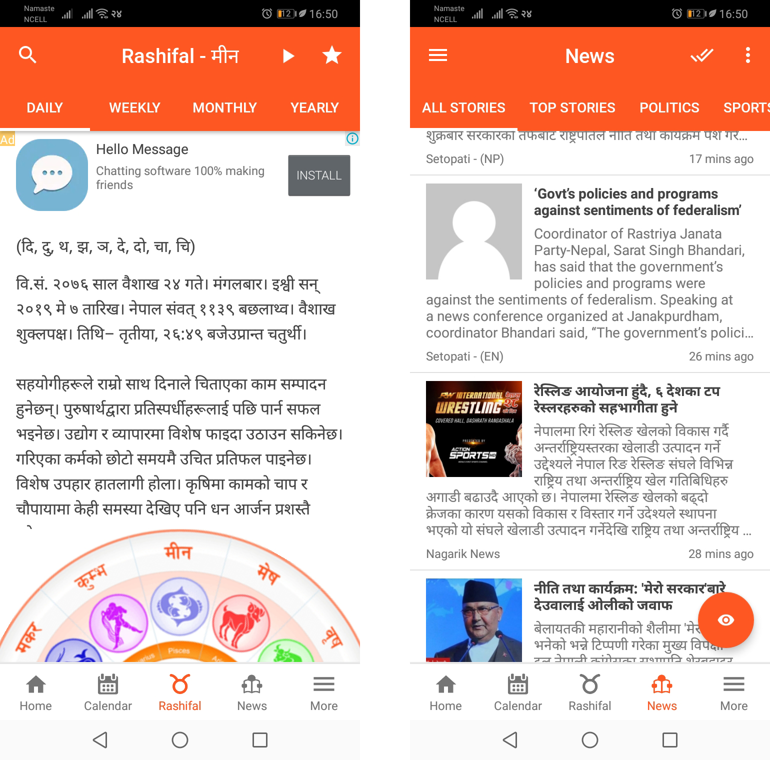
There are several overlapping features in the Nepali Patro app and the Hamro Patro app. For example, horoscopes. Again, I like Nepali Patro in this feature. There are two reasons for it. Nepali Patro has longer fortune descriptions for me that make me feel good (Hamro Patro only has 3 lines that sometimes don’t make sense). Also, Nepali Patro asks me my sign in Nepali and gives me a Nepali prediction. But, Hamro Patro asks me my sign in English and gives me a Nepali prediction. The convention to assign sign is different, so one’s english and nepali signs are different. Everyone knows that. Apparently, Hamro Patro doesn’t.
But now, let’s talk about the second most used features of these apps – news. Here, I found Hamro Patro is better than the Nepali Patro for some reasons. One is that news tended to load quickly in Hamro Patro than Nepali Patro, and they were easier to read on Hamro Patro than Nepali Patro.
The ads were less in-your-face in Hamro Patro compared to Nepali Patro. Another better feature in Hamro Patro is the ability to search for news and personalize it for its users. This was the feature Hamro Patro added in this Mega update. This makes an immense difference in the quality and the type of news that comes your way. I hope Nepali Patro can implement this feature in the coming days.
I also felt that the content was better and larger in volume in Hamro Patro compared to Nepali Patro. If you are a frequent Nepali news reader, Hamro Patro is still the app to go.
Other features
Also, Nepali Patro doesn’t have features like Tarkari bazar and gold/silver prices, kundali, FM radio, videos, and Nepali dictionary that Hamro Patro provides inside one app. Of these, I guess the FM radio and video are particularly useful.
My concluding thoughts
To sum up, if you only need apps like these to see Nepali calendar and know the Nepali date today, Nepali Patro may be a better choice for you. But, if you consume Nepali news and Nepali videos and audio, then Hamro Patro is still a better choice.
Overall, I am quite impressed by Nepali Patro and what the team has accomplished. They have made a simpler app that is not as feature rich as Hamro Patro but is more intuitive to use. If you have been tired with Hamro Patro lately, you can give this app a go. Maybe you will like it. I definitely did.
Download Nepali Patro for Android
Download Nepali Patro for iOS
-
Vivo Launches its Latest Entry Level Phone with 120Hz Panel in NepalHIGHLIGHTS The Vivo Y05 price in Nepal starts at Rs. 16,999 (8/128GB). The phone now…
-
Xiaomi Pad 8 Pre-Order Opens in Nepal: The Ultimate Value Tablet?HIGHLIGHTS Xiaomi Pad 8 price in Nepal starts from Rs. 59,999 for the 8/128GB variant.…
-
Xiaomi 17 Ultra Pre-Bookings Open in Nepal with Exciting OffersHIGHLIGHTS The Xiaomi 17 Ultra price in Nepal is Rs. 1,99,999 (16/512GB). It features a…


