Daraz, the largest e-commerce site in Nepal, has radically modified their app and their site. There is a lot of white in the redesign and as intended, the app feels modern, but it also feels a little different. We will talk about it a little later. Not only has the design changed, new features have also been added for the customers. The redesign was pushed out on 29th September after a lot of teasing and pestering notifications on our phones. Now, the site and app are here and we will tell you all about it.
Initial Impression
The first thing the customers will notice is the new design of the app. It feels heavily influenced by Google’s material design guidelines. People who were accustomed to the usual black and not-overly-white color scheme of the previous Daraz app or site will take some time getting used to it.
Buttons have been moved around, some new ones have been added. Navigating the app also will take some time getting used to. But once you get the hang of it, you will see that the app and the site have become much more useful for customers.
New Features
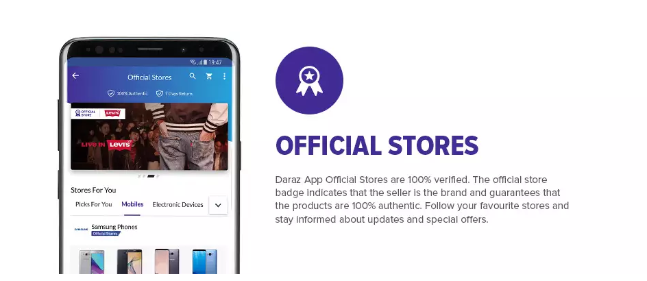
New sections have been added to the site and the app. (the app is the same as the site, just smaller. We think Daraz app may, in fact, be a web app. Can’t say for sure.) My favorite is the flash sale section that lets you see which items are going on sale on Daraz currently and which items will go on sale in the near future. This makes it super-convenient if you are on the lookout for the hottest deals. Another section is called the official stores’ section that shows products from stores that Daraz knows sell 100% genuine and high-quality products that customers love.
For Sellers
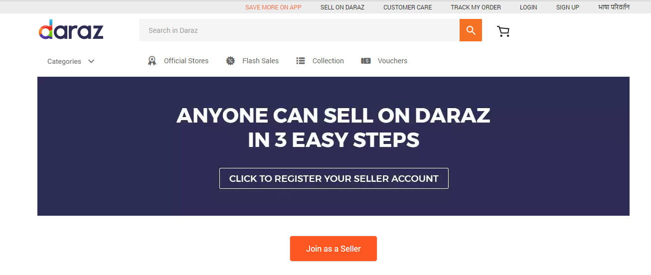
The redesign doesn’t just address the customers only. There’s a new seller center that allows potential sellers to register from the app or site itself and sell their products from the comfort of their home, or garage, or office.
If you wanted to grow your business but didn’t have the right infrastructure, this may be a golden opportunity for you out there.
Final Thoughts
We feel like this redesign is the right step for Daraz as it continues to expand in Nepal. It ties the whole Daraz experience together and makes the app and website more customer friendly. The ability to navigate flash sales is a thoughtful addition, so is the seller center.
The design feels modern and intuitive. As Daraz keeps on adding more products, the recommended section will be more useful. But, what do you think about the new app and site? Do you like or dislike the new design? How do you feel about the new sections? Don’t forget to drop your thoughts in the comments section below.
Visit New Daraz website: www.daraz.com.np
Download New Daraz app: Android / iOS
-
Huawei Band 11 Lands in Nepal: And This Time There’s a Band 11 Pro Too!HIGHLIGHTS The Huawei Band 11 series price in Nepal starts at Rs. 9,990. It has…
-
Vivo V70 FE Launching in Nepal Soon: Even Better Than V70?HIGHLIGHTS The vivo V70 FE price in Nepal could start from Rs. 60,999 (8/256GB). The…
-
Royal Enfield Goan Classic 350 Makes Entry in Nepal: Bobber Style Meets Classic SoulHIGHLIGHTS Royal Enfield Goan Classic 350 price in Nepal starts at Rs. 5.98 Lakhs and…


